Metadata/Classification
I’ve been looking around at all the new kids on the I-hope-Yahoo-buys-us block and thinking about how easy it is to mimic the form of a successful product without quite understanding what made it successful. What I believe differentiates a successful participatory web site from a lot of the wannabes is that you get something immediate from participating. With flickr, for example, by uploading a photo, you get a uniquely-addressable personal object that you can link to and you also get an audience (and potentially feedback) for that object. There is a lot more going on beyond this immediate gratification (access to a community, the ability to categorize your photos, etc.), but the key is that there is an immediate benefit to participation.
This reminds me that Tom suggested 3 insightful rules for social software:
- Every individual should derive value from their contributions
- Every contribution should provide value to their peers as well
- The site or organisation that hosts the service should be able to derive value from the aggregate of the data and should be able to expose that value back to individuals
So, what I’m talking about is his first rule. The trouble with a lot of products is that they skip this step and assume that people will contribute solely for the benefit of their peers and/or the network as a whole. Take, for example, Platial, which I don’t mean to pick on (in fact I think Platial is a great stake in the ground toward some really interesting stuff). In any case, I just can’t see the immediate benefit to adding and describing places in the system.
It’s so easy to get caught up in the network intelligence daydream, but designers and strategists need to think about the immediate payoff as well as the long-term generative impact. People will rarely work purely on spec unless they are really desperate or the potential payoff is large, but that’s what you’re asking them to do.
So, I imagine this is some kind of folksonomic counter-revolutionary blasphemy, but I was wondering if there was a place for hierarchy/structure in tags. Here’s the scenario: every time I add a photo of my son to iPhoto, I tag it with “Eli” and also with “Family.” It seems I ought to be able to tag it with just “Eli” and have “Family” follow along implicitly. Would it be helpful to have defined/definable relationships among tags. I mean, I like the freeness of freetagging as much as the next organic:living:human:guy, but sometimes I want more. Is that so wrong?
Tags tags tags tags folksonomy tags tags. Ethnoclassification tags folksonomy. Tags tags tags.
I recently installed iPhoto 5, and wow I can’t tell you how much Apple does not get keywords. This is the third completely different interface they’ve tried for tagging photos and they are all completely lame. First came this:

Which was cumbersome and semi-useless as we’ll see in a moment. Then, in iPhoto 4, they created this multi-modal abomination:

Which was so bad that people went and modified the code to make it at least suck a little less.
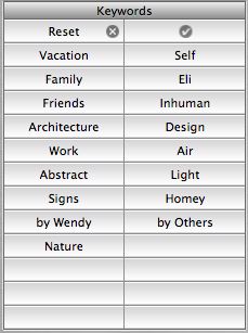
Now, they’ve gone partway back to the original (using rigid tiles for each keyword):

Which would be bad enough because it won’t scale past about 20 tags, but it’s made so much worse by the fact that in order to edit the tags for a given photo you have to select the photo, then choose Get Info, then choose the Keywords tab and then check the boxes for the tags you want to add:

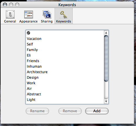
What’s that? You want to add a new tag? Well, of course, you simply go to the iPhoto Preferences and select the Keywords pane and use a third (!) totally distinct UI there:

Feh! Compare to, say, Flickr, where you simply click on “Add” next to the list of keywords for the current photo:


Now, I have a few gripes with the flickr tags UI, but next to iPhoto it’s the most natural, transparent mechanism in the world. But this is only interesting because it reveals a huge difference in the way that Apple and flickr’s respective designers seem to envision people using tags. The Apple model assumes several broad categories (the defaults are things like “Family” and “Vacation”) while flickr assumes actual descriptive metadata (like “red” and “insect” and “banal”). Which makes flickr’s tags useful and interesting and Apple’s not.
ps - I have more to say about tags, but I’ll save that for a later post.
Thomas Vander Wal’s Folksonomy Explanations throws some good glosses on the “folksonomy space”, but I have to question the conclusion: “Tags will be the step to the next generation of personal information managment.” IMHO, tags are a hideous way to manage personal information. They do make sense to me for non-textual information (photos, for example), but for email? Blecch… I spend way too much time dealing with each email as it is, and why should I have to tag them when they already have all the damn data they should need (who sent the message, what were we talking about, what other things were we talking about around the same time, how long, was there a URL embedded, etc.). I’m not saying email’s working as it is, but shucks, I certainly don’t want to have to tag my messages. Can’t, like, a computer do that for me?
Nice bit of agglomeration at Technorati, combining their tags with flickr and del.icio.us, though the limitations of the “tag” format become apparent in some cases. (via)
So… browsing flickr categories, I’m wanting some way of untagging other peoples’ photos. For example, I don’t want this or this to show up when I browse “abstract” photos.
In semantic blogging, Phil Wolff describes a “structure-enahnced blog item” and why you might want one. (via)
This has been written about to death, but I really think email clients need to be organized around faceted classification. It’s actually surprising given how data and context rich emails are that email clients have lagged behind photo and audio file browsers in the sophistication of their classification schemes.
Search (across and within mail folders) is a major improvement, but it sure would be helpful to assign keywords to individual messages and then be able to filter by keyword or date or author etc (and the distinction between filter and sort is an important one). Mike’s slider idea and interfaces like this make so much sense for email. I assume someone will email me a link to Lifestreams, but I’ve always been turned off by the way Lifestreams privileges Date over other organizing principles (although it probably makes more sense for email than other types of documents). There are other projects, but still I’m using folders within folders to manage most of my documents.
This is not to say that I see this as a lost cause; it’s easy to see that metadata-organized file browsing is around the corner. I think I’m just surprised how far behind the major email clients are.
Update: Thanks to Andrew for the link to Remail, a next-gen email project out of IBM. While many of the ideas (e.g. threads) have surfaced elsewhere, I haven’t seen anything like Remail’s Thread Arcs feature. I also like that it can incorporate RSS feeds. And, as expected, there’s a faceted classification mechanism called Collections.
Jorge Luis Borges, who I apparently need immediately to reread, describes a faceted classification scheme which divides animals into 14 categories (“those that belong to the Emperor,” “embalmed ones,” “stray dogs,” and so on). Don’t just think you get the point and move on. Go read the list, it’s quite amazing.