Experience Design
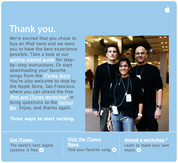
It’s been said many times, but oh man does Apple understand the difference between designing products and designing services:

All experiences can be measured along three scales: Social, Intellectual, and Visceral (or Heart, Head, and Hands if you want something catchy). For example:
Drinking in a bar:
Social: high
Visceral: high
Intellectual: low
Watching a sunset:
Social: depends
Visceral: high
Intellectual: depends
Reading a book:
Social: low (unless read out loud)
Visceral: low
Intellectual: high
Video game:
Social: depends
Visceral: medium
Intellectual: depends
Online community:
Social: high
Visceral: low
Intellectual: varies
Are there other parameters beyond the 3?
This helps explain what’s so exciting about location-aware applications: they promise to overlay the intellectual and social strengths of network-mediated interactions with meatspace. Either that or we’re all just zoning out looking at tiny mobile screens, wondering how the UI got so f***ed up.
File under there-should-be-a-standard, Steps for finding a human on various phone systems. Some of them are pretty amazing, such as Delta, where you say ‘agent’ four times until it finally gives you an agent. This is firmly in that part of the Venn diagram where business needs fail to intersect with user needs.
Seems that boo.com (you remember that site that exemplified the no-business model excess of the dot-com bubble) is now a business model.
You’ve surely seen pics of the outside of the new Seattle Public Library, but wow, the inside looks amazing. Wayfinding is a big issue in libraries, and not having been there I can’t say how well the SPL has done, but there’s no question what section this is or what you do here.
Dan Hill has an excellent thought-piece on the merits and pitfalls inherent in Apple’s design ethos of perfection. He’s also collected thoughts and links on the idea of adaptive design (i.e. designing for adaptation). From the article:
In essence, adaptive design is about designing to enable the user to change things. You strive for ‘good enough’ as a starting point, such that the user feels they have a ‘way in’, almost an implicit goal of working through the finished design themselves. It sees design as a social process, developing over time, via a relationship with the user. It draws heavily from [Stewart] Brand’s idea of separating a building’s architecture into 6 different layers, from slowly developing layers through to relatively quickly moving layers.
While Learning to Love the Pixel: Exploring the Craft of Icon Design is ostensibly about designing icons, it is the discussion of craft in interface design that I find most satisfying. I have long felt craft to be undervalued in the context of corporate design projects. The article does a nice job of beginning the discussion of the role of craft in user experience design while implicitly raising the higher-level question of where it makes the most sense to prioritize craft in an interface design project.
Just wanted to register a link to Nathan Shedroff: the v-2 interview. And here are peter’s (I think generally right on) comments on part one and part two of the interview.
I don’t have a whole lot to add. If you read beyond the “to-mah-to” / “to-may-to” posturing, the main gist of the debate seems to be the almost absurdly banal point that some designers are better than others (at considering business strategy, at selling design, at dealing with complex interactions). I find myself dismissing this sort of discussion as not all that relevant to the actual experience of a real design project and would rather read a case study any day.
David Bliss of Odopod, who I “met” via email recently, has a bunch of interesting writings up on his personal site on Experience Design and Interactive Storytelling as well as (if you poke around a bit) some nice generative-behavior experiments.
Beating a horse that refuses to die: Salon: DEN, Boo: R.I.P.:
“In the year 2000, there is no excuse for any professional Web site that expects to reach a wide audience of users to put on its home page an animation that requires a browser plug-in.”I disagree. I think, for example, that Animation Express (which I’ve worked on) is totally justified in having a Flash frontdoor. The site is a gallery of Flash (and some Quicktime and Shockwave) animation, and if you don’t have the plug-in, you’re not going to be able to see the content. That doesn’t mean you get a broken icon or a blank screen if you don’t have the plug-in. You just get redirected to a page that says it looks like you don’t have Flash and explains how to get it.
So, again, the problem is not using Flash or doing whizzy things, it’s doing them badly or foolishly. OK, I shut up now. (link via goodexperience)