Applications
For all you paper-fetishists out there (you know who you are), this sweet app lets you make a custom “PocketMod.” It’s a single sheet of paper that you fold to make a little book with things like daily, weekly, or yearly calendars, graph paper, to-do lists, etc. Very cool!
Veer Shuttleboard is so much better than the standard “lightbox” feature on stock sites. Very nicely implemented as a broad canvas with intuitive scaling, arranging, layering, and cropping features as well as notes… and then you can share it. Well done!
GUI / Graphical User Interface is basically a diorama version of the PSD interface, with no obvious reason to exist. The nit-picker in me has to point out that the document window actually floats behind the application menu bar (to my regular chagrin). (via)
This seems obvious enough that someone must have already thought of it, but… Photoshop and Illustrator (and probably most programs) really need variables. For example, if I’m laying out a page and I’ve made 5 elements on the page the same persimmon color, it would be so very sweet to be able to change the color in one place rather than having to go select each element separately and change its color. Is that something you can do with actions?
I recently installed iPhoto 5, and wow I can’t tell you how much Apple does not get keywords. This is the third completely different interface they’ve tried for tagging photos and they are all completely lame. First came this:

Which was cumbersome and semi-useless as we’ll see in a moment. Then, in iPhoto 4, they created this multi-modal abomination:

Which was so bad that people went and modified the code to make it at least suck a little less.
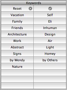
Now, they’ve gone partway back to the original (using rigid tiles for each keyword):

Which would be bad enough because it won’t scale past about 20 tags, but it’s made so much worse by the fact that in order to edit the tags for a given photo you have to select the photo, then choose Get Info, then choose the Keywords tab and then check the boxes for the tags you want to add:

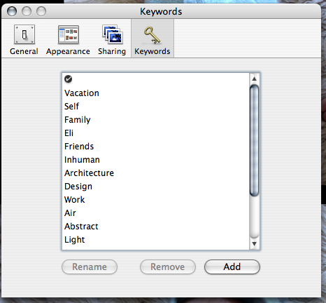
What’s that? You want to add a new tag? Well, of course, you simply go to the iPhoto Preferences and select the Keywords pane and use a third (!) totally distinct UI there:

Feh! Compare to, say, Flickr, where you simply click on “Add” next to the list of keywords for the current photo:


Now, I have a few gripes with the flickr tags UI, but next to iPhoto it’s the most natural, transparent mechanism in the world. But this is only interesting because it reveals a huge difference in the way that Apple and flickr’s respective designers seem to envision people using tags. The Apple model assumes several broad categories (the defaults are things like “Family” and “Vacation”) while flickr assumes actual descriptive metadata (like “red” and “insect” and “banal”). Which makes flickr’s tags useful and interesting and Apple’s not.
ps - I have more to say about tags, but I’ll save that for a later post.
It’s good to see Apple coming up on the short end of ease-of-use comparisons for a change, although as a Mac user I’m somewhat chagrined.
moockblog: nextgen flash player demo in tokyo… impressive stuff, including realtime bitmap (and video) effects (think Photoshop filters applied programmatically during Flash playback).
 Thanks to Mark’s email management method, I now have 0 messages in my inbox. Woohoo!
I’m looking forward to Apple Mail’s new Smart Mailboxes feature. It’s the Collections feature from Remail I was jonesing for a while back.
Autotrace is an open source app that converts bitmaps to vectors (just like streamline, RIP). And there’s even an online version (note: your art will be saved on their server, so it ain’t private). There’s also Silhouette, and probably others (or you can just use Flash’s Trace bitmap command).